Patterns
Using the grid manager is easy. Just create the widgets, and use the grid method to tell the manager in which row and column to place them. You don't have to specify the size of the grid beforehand; the manager automatically determines that from the widgets in it.
    Label(master, text="First").grid(row=0)
    Label(master, text="Second").grid(row=1)

    e1 = Entry(master)
    e2 = Entry(master)

    e1.grid(row=0, column=1)
    e2.grid(row=1, column=1)
Note that the column number defaults to 0 if not given.
Running the above example produces the following window:
Figure 27-1. Figure: simple grid example
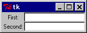
Empty rows and columns are ignored. The result would have been the same if you had placed the widgets in row 10 and 20 instead.
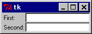
Note that the widgets are centered in their cells. You can use the sticky option to change this; this option takes one or more values from the set N, S, E, W. To align the labels to the left border, you could use W (west):
    Label(master, text="First").grid(row=0, sticky=W)
    Label(master, text="Second").grid(row=1, sticky=W)

    e1 = Entry(master)
    e2 = Entry(master)

    e1.grid(row=0, column=1)
    e2.grid(row=1, column=1)
Figure 27-2. Figure: using the sticky option
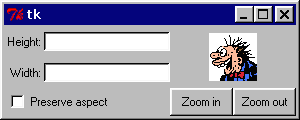
You can also have the widgets span more than one cell. The columnspan option is used to let a widget span more than one column, and the rowspan option lets it span more than one row. The following code creates the layout shown in the previous section:
    label1.grid(sticky=E)
    label2.grid(sticky=E)

    entry1.grid(row=0, column=1)
    entry2.grid(row=1, column=1)

    checkbutton.grid(columnspan=2, sticky=W)

    image.grid(row=0, column=2, columnspan=2, rowspan=2,
               sticky=W+E+N+S, padx=5, pady=5)

    button1.grid(row=2, column=2)
    button2.grid(row=2, column=3)
There are plenty of things to note in this example. First, no position is specified for the label widgets. In this case, the column defaults to 0, and the row to the first unused row in the grid. Next, the entry widgets are positioned as usual, but the checkbutton widget is placed on the next empty row (row 2, in this case), and is configured to span two columns. The resulting cell will be as wide as the label and entry columns combined. The image widget is configured to span both columns and rows at the same time. The buttons, finally, is packed each in a single cell:
Figure 27-3. Figure: using column and row spans