Options
The following options can be used for the Label widget.
Table 29-1. Label Options
Option | Type | Description |
|---|---|---|
text | string | The text to display in the label. The text can contain newlines. If the bitmap or image options are used, this option is ignored. |
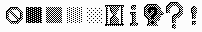
bitmap | bitmap | The bitmap to display in the widget. If the image option is given, this option is ignored. The following bitmaps are available on all platforms: "error", "gray75", "gray50", "gray25", "gray12", "hourglass", "info", "questhead", "question", and "warning".
The following additional bitmaps are available on the Macintosh only: "document", "stationery", "edition", "application", "accessory", "folder", "pfolder", "trash", "floppy", "ramdisk", "cdrom", "preferences", "querydoc", "stop", "note", and "caution". You can also load the bitmap from an XBM file. Just prefix the filename with an at-sign, for example "@sample.xbm". |
image | image | The image to display in the widget. If specified, this takes precedence over the text and bitmap options. |
width, height | int | The size of the label. If the label displays text, the size is given in text units. If the label displays an image, the size is given in pixels (or screen units). If the size is omitted, it is calculated based on the label contents. |
relief | constant | Border decoration. The default is FLAT. Other possible values are SUNKEN, RAISED, GROOVE, and RIDGE. Note that to show the border, you need to change the borderwidth from it's default value of 0. |
borderwidth (bd) | dímension | The width of the label border. The default is 0 (no border). |
background (bg), foreground (fg) | color | The label color (the foreground value is used for text and bitmap labels only). The default is platform specific. |
font | font | The font to use in the label. The label can only contain text in a single font. |
justify | constant | Defines how to align multiple lines of text. Use LEFT, RIGHT, or CENTER. |
anchor | constant | Controls where in the label the text (or image) should be located. Use one of N, NE, E, SE, S, SW, W, NW, or CENTER. Default is CENTER. |
wraplength | distance | Determines when a label's text should be wrapped into multiple lines. This is given in screen units. Default is no wrapping. |
textvariable | variable | Associates a Tkinter variable (usually a StringVar) to the label. If the variable is changed, the label text is updated. |
underline | int | Default is -1. |
cursor | cursor | The cursor to show when the mouse is moved over the label. |